THE CARLTON
The breadth of designers participating in this year's show stretches the spectrum from the new blood designers coming into their own alongside the well-established iconic designers whose resumes include induction into the Interior Design Hall of Fame. This year's show house was located once again on the upper eastside in The Carlton a massive five-story townhouse with a spectacular rooftop garden. Once again the effort put into constructing the rooms is impressive and disturbing at the same time. The time, money and connections needed to pull off these rooms is nothing short of miraculous but the temporal nature of the rooms is painful in that at the show's end everything needs to be ripped out much of which will then have to be thrown away.

I bought my ticket on the last Sunday before the show house was to close. It was a day scheduled for torrential rain so my thought was even though it was a Sunday, a typically high traffic day for the show, not many people would be willing to brave the weather for a trip to the show house. My calculations were pretty close to true. That Sunday had sparse attendance and with the new policy allowing, in fact encouraging, photography I was free to snap away without having to sneak around like some sort of design thief.

I was impressed the minute I stepped into the lobby designed by David Colins Studio, who came all the way from the UK. In the past almost all the designers being asked to participate were New York based but recently the net has been cast farther and farther. Right off the bat I could identify the wall color as Farrow and Ball. No one makes a blue/gray that even comes close to theirs. The mirrored walls with the convex inserts made the entry seem larger than it was and optically like walking through a fun house at the fair.
From there it was all on foot up the interior staircase with barely enough room for one person at a time to go either up or down. I heard there were complaints about a non-operable elevator but the walk was well worth the pain and agony of a five-flight exercise session.
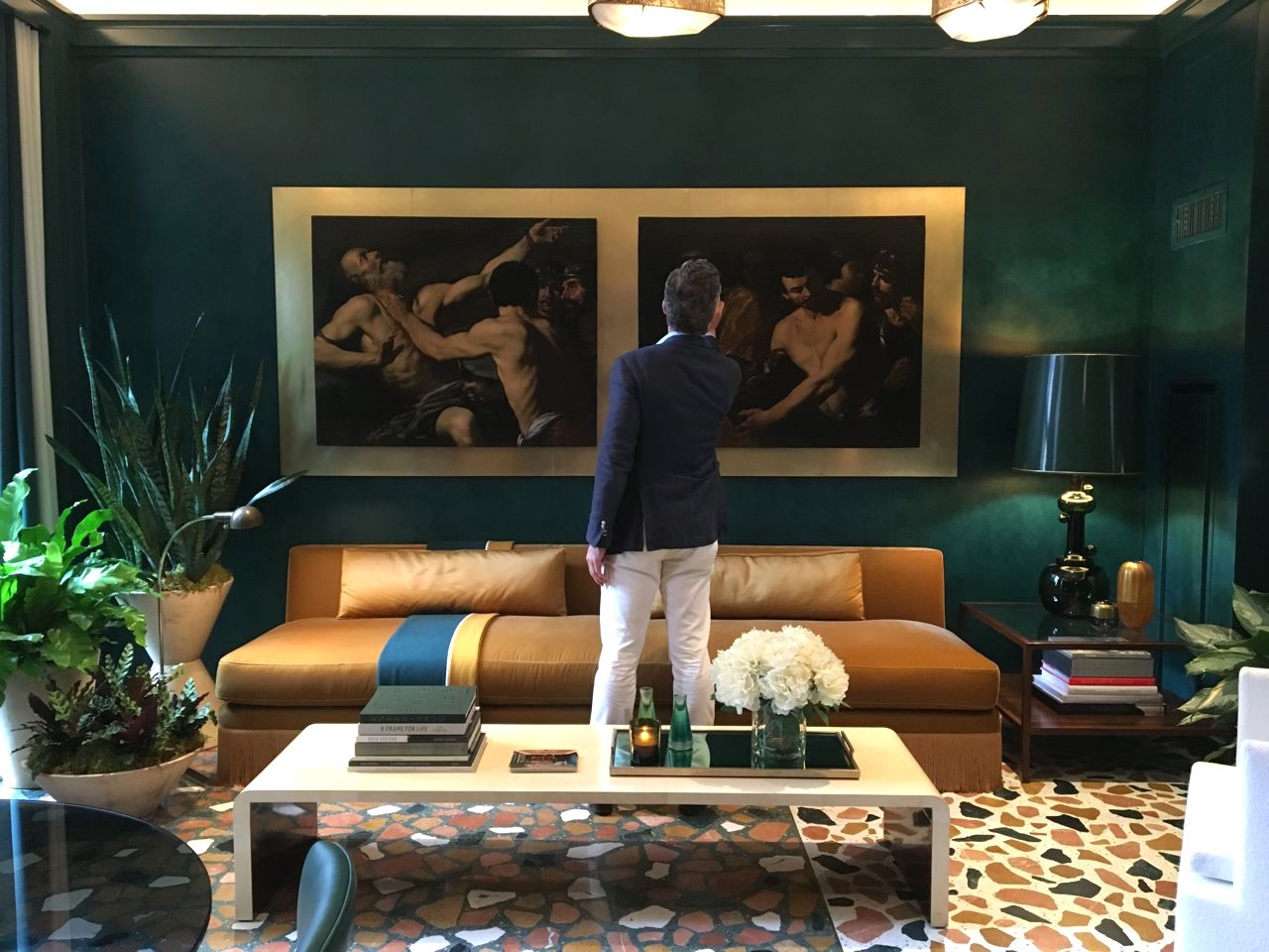
In years past there has frequently been a need by many designers to be outlandish for the sake of attention grabbing. This year there was less of that and more just beautiful, livable design. Suzanne Kasler Interiors had designed a room so comfortable I had a hard time photographing it. Every time I came back to it someone had decided to plop themselves down on either the couch or chairs slipping into relaxed conversations oblivious to me and my iPhone. It took three tries before I finally had the room vacant.
Across the hall from Suzanne Kasler's room was the way more elaborate atelier designed by Alex Papachristidis Interiors. Although it was packed with objects, papered in an outdoor motif and upholstered in shimmering fabrics the overall effect refused to make me feel like a bull in a china shop.
There was still an inviting allure to the space.
It may have had something to do with the antiquities that reminded me of our room when we did Kips Bay.
As usual the kitchens at Kips Bay show houses are beyond extraordinary and this one by Clive Christian Interiors was no exception. But as intricate and detailed as it was it wasn't my favorite.
There was way too much going on for me but apparently the owners of the Carlton thought differently in that they were keeping the kitchen after the show house ended.
Going way off to the other end of the design spectrum was the spectacular minimalist living room done by Victoria Hagan. The red lacquered fireplace set against the green topiary trees in a stark white envelope was arresting.
She had called her room "An American Dream". It truly was space made of dreams.
Following the fireplace as centerpiece theme I fell in love with this timber and faux painted fire surround by David Kleinberg Design Associates. There was such warmth being generated by the design that a fire in the fireplace wasn't needed to heat up the room. Watch out this my be inspiration for one of our upcoming projects.
Bedrooms were the choice of three designers as their transformation device. The result was the same for all three. Their bedrooms were exquisite and all three used canopy beds as their focal points.
For some reason Timothy Whelan named his bedroom "The White Orchard Room" unless this is some obscure reference to a movie I don't know I couldn't find one white orchid in the room.
What I did find is a bedroom I'd be happy to spend the night in. The room was tone on tone in pastels that could easily cure anyone's insomnia. This was a prime example of how to use a canopy bed.
Olansky & Sinsteden used twin beds to put together their Lucy and Desi inspired bedroom. It was an upholsterer's dream project. Everything from the walls to the curtains to the bedposts were covered in fabric in shades of soft grey-greens and soothing lavenders.
But, as might be expected, the envy of all bedrooms was the one designed by Drake/Anderson. This room was flawless. Who wouldn't want to indulge in the elegant luxury of that bed?
There is a lushness in the choice of every fabric from the bed linen to the drapery to the carpet to the fur throw draped over the companion chaises. Art is such a personal thing but here the pieces brought into the room seem to be right on point with the feel of the room.
Drake/Anderson succeeded in matching every aspect of their design into a cohesive space utilizing elements from an eclectic set of styles stretching from traditional to contemporary.
Whimsy also found its place squeezed in among all that elegance. Phillip Thomas put together a woman's office with Miro-esque squiggles playfully dancing around the rooms walls and then layering patterns and paintings in a way that forces you to smile.
Possibly the most editorial of all the rooms was designed by Garrow Kedigian. One should expect no less from a designer with a name like Garrow Kedigian. His name is evocative of the mystery behind his room. The use of chalk to delineate his architectural details is masterful. It was a room designed perfectly for a game of Clue. I think it was Colonel Mustard with the knife.
THE GALLERY
Odalisque 1, NY, 1943
Horst P. Horst, photographer
Represented by Robert Klein Gallery


No comments:
Post a Comment