Wednesday, October 24, 2012

WHEN A HOUSE IS NOT A HOME


IS THIS REALLY LIVING?
I may be wading out into dangerous water here but I'm going to go where no blogger should go and criticize a piece I recently found. I'm going to start by saying Remodelista is one of my favorite if not favorite design blogs out there. It beats me to every story. It has sources both nationally and internationally that I can only dream of acquiring. Its stories and photography are superior, but on this one occasion I'm not jumping on their boat with praise and envy. The story that got me going originates from Australia so I'm pretty sure no Aussies are gonna come knocking on my door looking for an apology. My beef with this story is centered around the suspension of reality in the field of design and the way we 99 percenters really live our lives.
The article is titled, "Living Large in 1,000 Square Feet, Family Included". The space belongs to a Sydney architect and his family. Thankfully there are no pictures of the actual family members. I'd suspect the children are still swaddled well into their teen years or locked in rooms not pictured in the article. This "home" is for me endemic of the problem many architects have when designing residential spaces. It points out the great difference between architects and interior designers in general. This does not hold true on an individual basis but as a huge generalization (this is my caveat so my architect friends who I do love and respect won't kill me after they read this) architects are space and form driven, sculptures of space concerned more with the envelop, the skin of a space than the physical pieces that will inhabit the space. Interior designers are more conceptual and driven by the personality of a space. Now here's a sentence architects are really going to take issue with but I secretly think some architects are little more egocentric. Their designs are more about them and the beauty of space than about the people who might inhabit their spaces. There's a sense that once the shell has been created there's no need to muddy up the design with artifacts of the family who will eventually try to live in their beautiful space.
Now I know this space is actually designed by the inhabiting dwellers but who the heck are they? I want to know who can live like this. Let's take the master bedroom. Where's the alarm clock and where's the extra chair piled with yesterday's clothes? I don't know about you, I've got a stupid superstition that if I don't make my bed in the morning I'll have a bad day. It keeps our room looking decent, but holy cow Rick's nighttime reading is on his bedside table and there's a dish for extra keys and change on mine. And where's the mirror? Now I know this is a hetero couple and we're not but there's no way either of us is going to go out the door in the morning without checking ourselves out before we leave. I've caught myself ready to bolt only to see my zipper clearly unzipped on several occasions. Don't straight people have the same worries?
Where are the pictures? Don't these people believe in art or records of their past? Call me crazy but I love putting reminders of who we once were and where we've been on our walls and in picture frames on side tables and over the mantle. Maybe we're too vain. Maybe they don't have a camera, god knows there's no cell phone left on the kitchen counter or maybe they're too uncomfortable with their past or present to reveal it to anyone by framing it and hanging it on the wall.
And what about the kids? I don't know about you but our sixteen-year-old has more stuff than a dog has fleas. We decided a long time ago that for her to develop her own sense of style and identity we would have to give up trying to make her room into our vision of what her room should be. We decided we would have to allow her permission to cover her walls with images of Justin Bieber and Cobe Bryant instead of Bette Midler and a shirtless Giles Marini. But by definition in this posting this family does include children. Where they keep them is a mystery to me. There don't appear to be any signs of children, no pb&j stains on the counter, no errant jelly beans under the sofa, and no baskets of laundry sitting around piled with unfolded t-shirts and single socks without their matching mate. Where are their kids' toys? I don' get it. Don't get me wrong. I can go Asian. I understand minimalism and I love it up to a point. I crave a less cluttered life but I want a life and I want my home to reflect that I've had a life, a life filled with memories worth displaying on my walls, a life represented by the things I love to collect and in the books I love to snuggle with up. I want comfy chair, no two chairs so I can sit with my partner and pet our dog even when he has muddy feet.

THE GALLERY
Take This Waltz, 2011
Christopher Moloney, photographer
Recent images by @Moloknee

Friday, October 19, 2012

THE LAUNCH OF THE MENDOTA COLLECTION

We've already done a post on our collaboration with Black Wolf Design resulting in a collection of new casegoods, tables and upholstered furniture aptly named the Mendota Collection. The launch of the new line will be at the MillerRossom showroom in Minneapolis this coming Thursday, October, 25th, 2012. We are extending an open invitation to all our friends and supporters to attend, if not physically then with their well wishes. We've had such terrific support over the past trying years we want all to know how much we've appreciated it and how grateful we are to all of you for that support.

Thursday, October 18, 2012

THE UPHOLSTERED DOOR


BE OUR GUEST

This is a first for us. We have the pleasure of hosting a guest posting by Mari from Arcadian Home. After reading Mari's post I'm sure you're going to want to see more so be sure to connect to their blog for more interesting postings on their take on the world of design.

ARCADIAN HOME
Hello all! It's Mari here from Arcadian Home blog, a wonderful place to find beautiful home decor inspirations. As a writer for Arcadian Home, I often have the amazing opportunity to visit interesting and inspiring blogs like Pleasant Living to share some of the beautiful interior design and decorating ideas I discover during my online travels. Today's guest post is about gorgeous upholstered doors. I've brought along images of eight interior spaces that show off some of these chic beauties. Please enjoy!A Paris apartment library gets an added touch of luxury with this green suede upholstered door. Unexpected bronze trim adds to the drama.
Nailhead trim and central metal medallions add a sophisticated touch to this meticulously crafted fabric-covered door.
Blue upholstery and golden metallic trim give these doors (there are two of them, the second one is just out of sight on the left) an extreme makeover and adds even more color to this joyful space.
A shimmery silver tufted door seems the perfect design choice for this glam bedroom.
This one might be my favorite of today's offerings, with its stylish doors upholstered in muted blue and stunning shapely chairs.  I love the table decorations-simple and beautiful!
John Saldino beautifully demonstrates the power of pale tone on tone with these doors upholstered in soft and supple leather.
Upholstered doors with double rows of nailhead trim open to reveal this dramatic bath.
No need for wall art here as the room and entryway are reflected in the massive mirror.Here, nailhead trim is used to add interest to gray blue upholstered doors-a chic slightly glam touch for this eclectic bedroom.  Images 1 | 2 | 3 | 4 | 5 | 6 | 7 | 8 We hope you enjoyed these fantastic ways to give your doors a new twist and add a unique element to your home. Be sure to check out the array of lighting and decor that Arcadian Home has to offer!


THE GALLERY
Nicole Kidman, 2003
Annie Leibovitz, Photographer
From her book, Annie Leibovitz:A Photographer's Life, 1990-2005

Thursday, October 11, 2012

BLACK AND ORANGE


WHEN HALLOWEEN ISN'T HALLOWEEN
We've had a love affair with orange that's been going of for a quite a long time; for Rick it's been years, for me it's been more of a flirtation. Although my relationship has been sweet and tangy I'm still a little insecure as to its longevity. What adds some spice to my affair is the pairing of juicy orange with the velvety smoothness of black. Halloween be damned. I can live with the combination of black and orange 365 days a year.
Who wouldn't want to sip a Bloody Mary while sitting at these chopping block dining tables or cut into a steak cooked rare and dripping in luscious animal blood. The China Grill located in the Hilton Marina in Ft. Lauderdale overlooking the intercostals waterway is a beautiful setting for any vampire. Robert Pattinson should take note.
A bit more airy and far less scary this home by Mao Lopez is stunning in it use of black and orange. Its mid-century aesthetic plays perfectly with this color combination throughout the entire home adding sophistication without crossing the line into kitsch.
A more contemporary take on orange and black sizzles in this apartment dining area. The chevron wooden floor grounds the plywood and glass table while the orange chairs add the right touch of warmth and the black and white photograph adds a window to the world and a touch of whimsy.
Crossing back to the dark side, this lounge is more inviting than foreboding. The rich flannel fabrics and the low lighting are more romantic and comfortable than bewitching and intimidating. If these walls could talk I have a feeling this room could wreck a few marriages.
Transitional spaces can sometimes seem a bit predictable but this bedroom avoids the ho-hum with its use of orange and black. The bold orange wallpaper and the black linen give this room attitude and swagger beyond the beiges nine out of ten traditionalists might have used.
I have to concede that this art is tending more toward the macabre than these previous interior design projects in black and orange but there's such a touch of humor in Mark McGinnis' series of "Religious Icons" I couldn't resist adding them to the post.
Orange bubble lights suspended over a reclaimed wooden cocktail table in front of a chalkboard black wall makes for an art director's dream. The styling of this interior is perfection right down to the perfectly placed black handbag. Spaces like this are all in the details.
Even we've gotten into the act from out business cards to our atelier displays.
Here we've paired an orange serving tray from Global Views with a black rubber bowl made in Africa from recycled tires, we added a touch of mystery with a crystal ball by Barbara Berry and set it on our Emmy chocolate walnut center hall table. The world's a stage and we sometimes pretend to be its directors.
As a final touch the porch on Peter Pennoyer's winter Adirondack retreat is an amazing leap of design risk taking. Not many homeowners let alone architects would have the nerve or the imagination to paint their home charcoal and then highlight the trim with splashes of orange. The risk here is well worth the end result. There's a certain amount of wickedness involved but there's also a huge amount of charm.


THE GALLERY
Polina, Russia
Joyce Tenneson, Photographer
From her book, Light Warriors

Thursday, October 4, 2012

LOOKING FOR A MADISON CRAFTSMAN MEMBERSHIP CARD


MADISON CRAFTSMAN STYLE
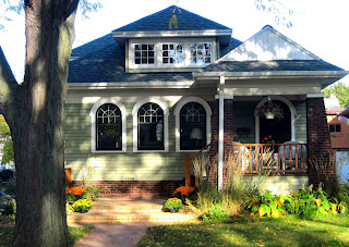
Madison has always been an American architectural treasure. Spring Green, the birthplace of Frank Lloyd Wright, is just west of the city and there are many examples of his genius erupting from its rolling hills and lapping the shorelines of the lakes that form the identity of this fabulous city.
But the city is not only defined by his civic buildings and National Register residences, it also holds a humbler legacy from the impact his Prairie Style of architecture has had on the more modest neighborhoods filled with Craftsman style bungalows.
These modest homes dot the surrounding near east and west sides of town. There's a definite pride taken in these homes by their owners. It almost seems like a cult-like existence exists among the people who own these homes. It's as if they belong to some secret organization that requires a long certification process to enter the group as an owner of a Madison born craftsman home.
The homes all seem to be more meticulously kept and maintained than normal. Their exteriors always freshly painted and scrubbed and their lawns a little lusher than others even though they too experienced the draught the rest of us withered through this summer. Secretly, Rick and I covet a membership card in this selective society.
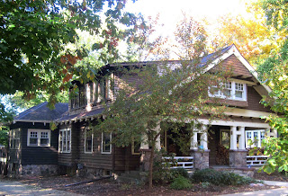
Most of these homes have a history in the American Craftsman movement that gave them birth in the early 20th century. The Craftsman movement developed as a reaction to the Victorian era where notable architecture was a birthright of the rich only. The Craftsman movement gave architectural dignity to the middleclass and changed the way America could dream about its future.
There was a scaling down of the Big Bug Hill mansions to a smaller scale where the domestic duties of maintaining a household could be handled by an average housewife without the benefit of a bevy of servants to help out.  Homes became smaller. Ceiling heights dropped. The form of the home became more horizontal than vertical.
Low-pitched roof lines with extending eaves where characteristic aspects of the exterior look of the structures.
A mix of materials also intermingled on their facades establishing intricate rhythms with decorative elements playing along the outer walls. There was a great pride in the individual craftsmanship of each home, like snowflakes no one seemed to be a duplicate of another.
This perception persisted even though many of the homes were a product of a kit you could order through Sears.
With fall here and the desire to nest strong our thoughts travel through these glorious Madison enclaves with desire scribbled all over them. I couldn't resist the opportunity to drool a little over a modest but earnest wish for that membership card into the tightly knit Madison Craftsman Home Owner Fraternity.

COME SHARE A DRINK ON FRIDAY NIGHT
Once again we missed the deadline to officially participate in Gallery Night but we'll still keep our door open, the wine bottle uncorked and the apple cider simmering. Stop by if you're out and about, we'll keep a light on and the music softly playing (we're too old to let it blare).

THE GALLERY
Frank Lloyd Wright, ca 1954
Berenice Abbott, photographer
Represented by G. Gibson Gallery, Seattle