This begins a four part series on New York. The four parts are in no particular order and may also break the mold of holding off until the next nearest Thursday to post. So let’s get off to the races with part one: Peewees.
MUSEUM OF ART AND DESIGN
Located on Columbus Circle the Museum of Art and Design (MAD) was at the center of a huge preservation battle with artists, architects and critics yelling “no” but the politicos and administrators saying “yes” to the new design by architect, Brad Cloepfil and his Portland, Oregon based firm. The politicos and administrators won out not only riling the arts community but taking the architect, poor Brad Cloepfil with them by demanding windows that unintentionally form an “H” to the north and an “I” to the west. It may have been a welcome to visitors but the architect felt as if they had also added an “S” to the east and a “T” to the south. The exterior remains an ongoing controversy but what goes on inside is currently worth a long look.
The present exhibition, “Otherworldly” opened on June 7th and will remain open until September 18th. When I walked into the museum, mostly to get out of the unbearable heat, I wasn’t sure I was going to go any further than the gift shop, but since it was my last day in the city and I hadn't done anything remotely cultural I thought I should see what the museum of art and design had to offer. Their cover image for the exhibit was two large fingers holding a tweezers over some miniature flower. Here’s where their marketing kind of matched their exterior. Not the best image to suck people in to the exhibit, a little old-fashioned. If might have appealed to a needlepoint crowd but it sure didn't seem very hip. What I did find out once I got off the elevator, stretching from the fourth floor gallery on up through the fifth floor were some of the most amazing “otherworldly” pieces that blurred the line between art and design, and reality and façade. I was Gulliver in a land of peewees. Everywhere you looked the world was miniaturized.
Hypochondriac (2010) by Amy Bennett was indicative of the power of this world of peewees. Amy does much of her art by first producing miniature models of her imagination and then painting them in oil at a scale similar to her models. Hypochondriac is a mere 2” square but the proportion of that little solitary figure sitting on that examining table in that multi-layered green walled room so poignantly depicted the enormity of human loneliness. At two inches square I felt as if I was looking into a cavern so deep and filled with sorrow and pain.
Many of the artists included in the exhibit were comfortable with their 3-D models being their final comment. Some like Amy Bennett used their models as stepping stone into the dimension of another media. Lori Nix created her Beauty Shop (2010) model as a means of examining space and life from a dystopian point of view. At first glance of one of her photographs you’re tricked into seeing a human scale reality of destruction and deprivation, but on closer inspection you begin to distrust the reality of what you see and begin to revel in the miniaturization of our woes.
One of the more exciting uses of video was Junebum Park’s 3 Crossing (2002). The playfulness of this piece was mesmerizing. It ran like a child’s video game with a big hand shuffling people across streets and blocking traffic to allow the pedestrians to get safely to the other side. Played at high speed the effect is both comic and endearing. Junebum’s hands become our superior protector as we scurry through our normal day-to-day lives.
In the center of the fifth floor stands a tall white box with a gray grid evocative of a non-descript office building pulled from an urban anywhere. On one side at about eye-level are two glass windows where you can peek into the space, an office of total monotony. The only sign of life is a hologrammed swivel desk chair spinning round and round and round. The miniaturization of David Lawery and Jaki Middleton’s Consolidated Life’s (2010) reality leads to this gray expanse of infinite boredom.
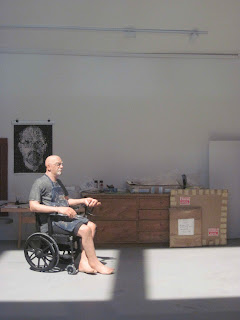
Probably the most ironic piece in the exhibit is a piece by Joe Fig. Chuck Close: Summer 2004 (2005) depicts the artist, Chuck Close, at work in his studio, personal letters, works in progress, and the artist in his wheel chair are all recreated in amazing accuracy in a space 24” x 31” x 42”. He has created the personal worlds of many of America’s best-known artists and then transformed this into a book, Inside the Painter’s Studio. Funny his work on Chuck Close should end up in an exhibit in a building that same artist fought tooth and nail to never see built. I think if he saw the exhibit he might forgive the museum just a bit.
“Otherworldly” at the Museum of Art and Design, NYC, June 7, 2011 to September 18, 2011.
THE GALLERY
Charles Matton (French 1931 – 2008)
At work on one of his amazing Peewee recreations
The New York Loft, 26th Streeet, 1986


No comments:
Post a Comment