Friday, October 28, 2011

TANGERINE & PUMPKIN

TANGERINE & PUMPKIN
The spicy smells of pumpkin baked with cinnamon and twisted curls of tangerine rind swimming in mulled cider are slowly filling the air.  There's a chill here and when there's a chill there's no better remedy than filling your world with the warmth of orange.
Stack up some Hermes boxes under a console and you've lit a fire below a piece of furniture that has become a fireplace where none existed. These boxes are just the thing to heat up a room.
Orange is the color of heat and that fire can be seen in this transitional living room by Donovan as seen in Elle Décor.  You don't need to wrap up in shawl to feel the warmth from that deep orange chair and ottoman.
There's no lack of heat in this traditional dining room by Jamie Herzinger Interiors. Who wouldn't want to sit at that dining table and eat some spicy Chinese orange chicken straight out of a to-go box with a pair of onyx chopsticks.
We only allowed the ceiling to escape our tangerine paint brush when we designed this retro living room for an artist on New York's upper East Side. Our client constantly tells us how this color palette changed her whole outlook on life. She can't walk into her apartment without smiling.
Steve Shortridge's contemporary home in Venice, California has splashed orange throughout in a way only a California designer could. Here the heat is a dry warm heat, the kind of heat you'll only find in Southern California's rendition of fall.
Sometimes the best way to spice up your home is with contrasting hits of color. Think of a soft dove grey room and then think what it might feel like if you added this orange striped gilded couch by MetroSofas.
Put any one of these amazing orange glass vases from The End of History on Hudson Street in New York City on a console or mantle and watch the place start to sizzle. A hit of orange through a vase or a pillow can go a long way in heating up a room.
Sometimes you can turn the volume up where the spiciness of tangerine is so potent we can taste it,
and sometimes it's a subtle note that warms our doorway and welcomes our guests.


RICK'S TIPS
Orange is best used with white, yellow or blue.  To use it in decorating shows courage, daring and style.  Think of a cool watery blue room, almost monochromatic, a soft watery blue green lamp with matching drapes, creamy walls and then there it is...the pop of an orange vase of tulips. Do it!


FROZEN TANGERINE PUMPKINS
I remember a vendor on a Paris street serving hollowed out oranges filled with sorbet from a two-wheeled cart filled with ice. For a few francs, this was way before the Euro, you could buy one of these mini fruit bowls packed with sweet ice and a hint of mint, the perfect refreshment for a summer stroll through les jardin du Luxembourg.
With summer gone, Paris thousands of miles away, and brittle fall leaves doing summersaults across our pebbled front yard I'm ready to embrace autumn's gift - the tangerine. Fall brings with it bowls of potpourri filled with the mingling scents of tangerine and cinnamon, the smell so enticing you want to bit into it and let the juice trickle down your chin. Here's my recipe for making this happen.
I'm going to tell you right up front (I know I've said this before) I'm much more Nigella Lawson than Martha Stewart. Nothing's perfect and if your final result looks a little cock-eyed or messy, embrace its flaws and revel in its ingenuity.
The ingredients for my frozen tangerine pumpkins is pretty basic:
8 to 10 Fairchild tangerines (remove those damn stickers)
A quart and a half of vanilla ice cream (in Wisconsin the local manufacturer makes one called Uff Da Vanilla - the richer the better)
Cinnamon to taste
First, get out a cutting board and a sharp knife. I use a steak knife, it's not too big and not too small, it's just right. Have a bowl handy for the juice and pulp. Now cut a cone out of the bottom of the tangerine. It seems logical to cut out the top but the stem side seems to stay in tack better than the bottom button. You need to clean the pulp off of the cone. Here's one place where you do need to be relatively neat. Now take your knife and run it around the inside of the tangerine. Try to stay as close to the skin as you can. If you poke through don't worry, you're going to freeze the thing anyway. Throw out the seeds and save some of the pulp and juice in the bowl you were supposed to bring out before you started. Don't bother with those sectional membranes, they're too chewy and not worth saving. Here's where Martha would make you get out the tweezers and get the inside of your tangerine down to the pure white inner backing of the peel. I'm not that picky. Get out what you can but don't go nuts.
Once you've cleaned out your tangerines it's time to mix the ice cream concoction. Depending on the current temperature it's best to have left the ice cream out for about fifteen minutes before you need it. You want it soft enough to mix but not soupy. Scoop your ice cream of choice into a medium sized bowl, add some of the pulp and juice you saved from the hollowed out tangerines, sprinkle with cinnamon to taste and then mix.
Spoon the mixture into the tangerines. To give your tangerines that pumpkin look poke a hole into the top of the cap. I gathered some twigs from our yard. I found a couple that still had some leaves attached. Some people might have some qualms about cleaning those sticks. I say forget about it, it's a stick. How dirty could it be and how the hell would you clean it anyway?
Pop your little deserts in the freezer and voila! Serve with a plastic spoon from a street vendor and think of Paris.


MORE OR LESS
I have always contended that good design doesn't depend on money, at least not money alone.   I've spent a career matching "the proverbial Gap T-shirts with Armani suits "or the decorating equivalent to that fashion trick employed by many even the ever stylish Sharon Stone in order to create beautiful spaces while trying to stay on budget.  The trick here is to watch the quality quotient.  Finish is usually the first give-away of a poor quality item.  Wood should look like wood, stone should look like stone, and you get the idea.  These days construction doesn't have to be flimsy to make something for a lesser price and veneers are used throughout the industry whether high or low.  Just pay attention to how they are cut, glued up and used.  MDF is not a four-letter word but particleboard is.  Structure is important.  Chairs, sofas and benches should support people of substantial size and tables should never wobble.

This week's finds:
More: Eames Molded Plywood Chair by Herman Miller at Room&Board $909

Less: Replica Eames Dining Chair by Matt Blatt $295


THE GALLERY
Dramatic Skies, 2006
Photographer, unknown
Digital Camera Magazine, Malaysia, October 2006 issue

Friday, October 21, 2011

PHOTOS, FRIENDS AND HALLOWEEN

AN OPENING TO REMEMBER
Last Friday night was Gallery Night in Madison, an event sponsored and created by the Madison Museum of Contemporary Art (MMoCA). They hold the event twice a year, once in the spring and then again in the fall. This fall 67 different venues participated on the same night as the fourth ranked Wisconsin Badgers homecoming. It's becoming more and more difficult to schedule an event in Wisconsin that doesn't coincide with an important sports competition, the sacrifices we have to make for living in a state that boasts the Badgers, Packers and Brewers. If you didn't catch the gloat, it was there.
This was our first official entry into Gallery Night. We lucked out with a balmy night. The wind had blown most of the leaves off the tree next door leaving a layer of tiny golden coins over our pea gravel front yard. The porch was lit with candles swaying inside rusted hurricane shades in the brisk breeze.  Rick had prepared a fruit and cheese plate along with miniature BLTs made with an amazing pesto mayonnaise.
Susan Johann's amazing photographic images were the first thing you encountered once you entered through the black front screen door. We've now added photography gallery to our store's description and Susan's work was the perfect way to inaugurate the tradition of photography exhibitions into our business. With any first attempt there's a certain amount of angst. The event was scheduled to begin just before dusk. We told ourselves, "Well, if no one shows we'll have all this food and wine to ourselves". No one wants to be the first to arrive at these events so the first hour went by and only a handful of people had turned out for the show, but as the sun started to hide behind the capitol the crowds started to grow. At one point the narrow alley between the front and back rooms was packed to the point of not being able to get from one room to the other. It was a tight squeeze and guests were forced to wait their turn to make it through the space.
Susan's work will up through the end of November but we will continue to represent her work here in the Midwest. Selling art is always a tough business. The selections are so personal. Either a piece speaks to you or it doesn't. Susan's work has always spoken to us. We promise to continue showing work that we feel exemplifies the best, work that motivates and inspires us, work that we would want to hang on our walls.
BUILDING BOO'S & DO'S FOR HALLOWEEN
We scoured the internet for other architectural and interior design obsessed fanatics looking for the perfect Halloween costume embracing their love for a special building or design element. Our unofficial poll placed the Chrysler Building with a huge following and the Empire State Building holding on to a very solid number two position.
History has shown some extraordinary examples of connecting the holiday with the design fields. From the famous Society of Beaux-Arts Architects annual costume ball in 1931where prominent architects of the day were asked to come as their favorite building
to this intricate recreation of Vienna's Stephansdom Cathedral, don't even think about trying to do a Viennese Waltz in this get-up.
Oskar Schlemmer, noted German designer, brought his costumes down to these magnificent geometric shapes.
His work was the inspiration for second year graphic design students at RISD to come up with their interpretations of current architectural designs. Even kids have gotten into the act like these three precocious New Yorkers dressed as Marcel Breuer's Whitney, Frank Lloyd Wright's Guggenheim and SANAA's New Museum in New York City.
In our popularity poll the world of architecture far surpassed the field of interior design and window treatments were by far more popular than upholstered pieces or casegoods. I guess going out on Halloween as a Ruhlmann breakfront puts a crimp into your dance moves,
although I do love this trio of wallflowers who were creative enough to put themselves out there as a settee. It's a very creative way of getting someone to sit on your lap without having to pay for it. 
Others have taken to their beds for the event
but my favorite is the man who puts it all out on display in one of the architectural and engineering wonders of the world, the Port-A-Potty. If any of you out there have any images you think can compete with these, send them on and we'll make one last effort to get the word out before the Halloween parades begin.

RICK'S TIPS
WHERE MORE IS MORE
Providing food for an event like our Gallery Night when you have no idea how many people will show is difficult. So here is what I do. A beautiful fruit and cheese platter is always nice to have even if somewhat expected.  It is very easy to assemble and I always buy more than I think I will need. Then if there are leftovers my frig is stocked with some good nibbles for the next few days. I make one main hors d'ourve like the BLT's (you can find cocktail size loaves of bread in most supermarkets) or sometimes mini cheddar and sage biscuits stuffed with ham, tiny blintzes smeared with a flavored cream cheese topped with rolled slices of smoked salmon or prosciutto.  Just keep unopened back-ups of things like nuts, flavored crackers, cheese sticks or bread sticks and bowls of olives or cornichons.

MORE OR LESS
I have always contended that good design doesn't depend on money, at least not money alone.   I've spent a career matching "the proverbial Gap T-shirts with Armani suits "or the decorating equivalent to that fashion trick employed by many even the ever stylish Sharon Stone in order to create beautiful spaces while trying to stay on budget.  The trick here is to watch the quality quotient.  Finish is usually the first give-away of a poor quality item.  Wood should look like wood, stone should look like stone, and you get the idea.  These days construction doesn't have to be flimsy to make something for a lesser price and veneers are used throughout the industry whether high or low.  Just pay attention to how they are cut, glued up and used.  MDF is not a four-letter word but particleboard is.  Structure is important.  Chairs, sofas and benches should support people of substantial size and tables should never wobble.

This week's finds:

More: The Sorraia Queen Bed in walnut at Holly Hunt $9,120


Less: The Pavillion Queen Bed from Crate & Barrel $1,199


THE GALLERY
Winter Hydranga
Susan Johann, Photographer
Available through Pleasant Living

Thursday, October 13, 2011

WALLS OF ART - DOORS TO AUTUMN

FLOOR TO CEILING ART
There's a formula that says you should hang a piece of art so the center of the piece is at eye-level with an adult of normal height. I like to break the rules and I'm not alone. I've always enjoyed art. Even as a kid I'd load my walls with art that inspired me, made me dream of exotic locals, romantic adventures and the shear beauty of the world. When I was a teenager a gallery opened on State Street selling etchings, serigraphs and woodcuts by the likes of Picasso, Warrington Colescott, Vaserely and Miro. Stopping in and looking at the art became a weekend pilgrimage for a small group of friends. When my parents built their new home they gave me a small budget to purchase some art. This was the beginning of my art collecting passion.
Since then Rick and I have collected photography and weekend painter's art, turning our collecting from a hobby to an obsession. Most homes have a limited amount of wall space; ours was no exception. The issue then became how to display our collection short of buying a bigger apartment. Here's where breaking the rules comes in. We Installed floor to ceiling metal shelves where we could house our collection and move it around. We stacked photos in front of photos and periodically rotated the pieces making our collection a living wall always changing and evolving.
William Frawley, not the one who played Ricky and Lucy's landlord and clearly valued his rent payments over decorating his walls but William Frawley the accessory designer and art collector, has broken the rules with his passion of collecting. His passion for figure studies both photographic and oil dominate his living quarters.
Every minute is like a huge party filled with guests in costumes where clothing is optional. You can imagine whispered conversations and slightly inebriated conversations being held amongst the gathered guests watching from his walls.
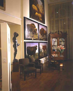
When John Stevenson began showing the work of Mark Beard in his atelier the placement of Mark's grand scaled work forced your eyes to climb the twenty-foot walls to take in the beauty and magnitude of his work. The enormous scale of Mark's work worked best on the huge walls of John's gallery.
Eric Choler has always thought out of the box when hanging art in his design work. His rule breaking has included hanging art in front of windows when one would have the view was enough, or covering over the classics in a library bookcase with a beautiful portrait. Here he has lined a staircase with a photography collection. Where many would have hung a few, he has assembled a collection of multiple sized pieces in various frames of seemingly incongruous thematic topics and created a unified whole. It would take me hours to ascend that staircase.
It's alright to break a few rules, as long as you don't hurt anyone. Go on live a little. Frame your collection of 60's Lps, hang them floor to ceiling and don't feel bad about putting your daytime napping divan right in front of them. It could make you more interesting having people think about what you might have to hide


AUTUMN'S BOUNTY
I've always had mixed feelings about autumn.  The light is absolutely beautiful, heavenly really. The smell of a warming fire on the first chilly night is heady.  The crunch and crackle of walking through the fall rainbow of fallen leaves completely invigorating.  Still, it means very soon it's going to be freezing cold making me house bound and stir crazy. This year I've decided not to focus on the impending chill but to focus on the goodness of autumn.

Autumn's bounty is without parallel.  Flowers, fruits, vegetables are at their best and much of it can be had for free.
I comb the fields for Goldenrod, wild asters, fallen acorns and branches laden with golden and crimson leafs. Sunflower heads are downright magical. All of this bounty can be brought into your home to make it cheery and bright.  And for a heavenly scent try a bowl of freshly picked apples.


There is a harmony in autumn, and a luster in its sky, which through the summer is not heard or seen, as if it could not be, as if it had not been!
Percy Bysshe Shelley


MORE OR LESS
I have always contended that good design doesn't depend on money, at least not money alone.   I've spent a career matching "the proverbial Gap T-shirts with Armani suits "or the decorating equivalent to that fashion trick employed by many even the ever stylish Sharon Stone in order to create beautiful spaces while trying to stay on budget.  The trick here is to watch the quality quotient.  Finish is usually the first give-away of a poor quality item.  Wood should look like wood, stone should look like stone, and you get the idea.  These days construction doesn't have to be flimsy to make something for a lesser price and veneers are used throughout the industry whether high or low.  Just pay attention to how they are cut, glued up and used.  MDF is not a four-letter word but particleboard is.  Structure is important.  Chairs, sofas and benches should support people of substantial size and tables should never wobble.

This week's finds:

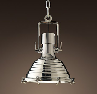
More: The Cargo Pendant by Urban Archeology $4,335

Less: The Mariime Pendant from Restoration Hardware $625


THE GALLERY
Bank, Andes, NY, 1987
Lee Melahn, Photographer
Available through Pleasant Living