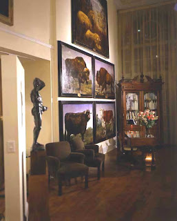
There's a formula that says you should hang a piece of art so the center of the piece is at eye-level with an adult of normal height. I like to break the rules and I'm not alone. I've always enjoyed art. Even as a kid I'd load my walls with art that inspired me, made me dream of exotic locals, romantic adventures and the shear beauty of the world. When I was a teenager a gallery opened on State Street selling etchings, serigraphs and woodcuts by the likes of Picasso, Warrington Colescott, Vaserely and Miro. Stopping in and looking at the art became a weekend pilgrimage for a small group of friends. When my parents built their new home they gave me a small budget to purchase some art. This was the beginning of my art collecting passion.
Since then Rick and I have collected photography and weekend painter's art, turning our collecting from a hobby to an obsession. Most homes have a limited amount of wall space; ours was no exception. The issue then became how to display our collection short of buying a bigger apartment. Here's where breaking the rules comes in. We Installed floor to ceiling metal shelves where we could house our collection and move it around. We stacked photos in front of photos and periodically rotated the pieces making our collection a living wall always changing and evolving.
William Frawley, not the one who played Ricky and Lucy's landlord and clearly valued his rent payments over decorating his walls but William Frawley the accessory designer and art collector, has broken the rules with his passion of collecting. His passion for figure studies both photographic and oil dominate his living quarters.
Every minute is like a huge party filled with guests in costumes where clothing is optional. You can imagine whispered conversations and slightly inebriated conversations being held amongst the gathered guests watching from his walls.
When John Stevenson began showing the work of Mark Beard in his atelier the placement of Mark's grand scaled work forced your eyes to climb the twenty-foot walls to take in the beauty and magnitude of his work. The enormous scale of Mark's work worked best on the huge walls of John's gallery.
Eric Choler has always thought out of the box when hanging art in his design work. His rule breaking has included hanging art in front of windows when one would have the view was enough, or covering over the classics in a library bookcase with a beautiful portrait. Here he has lined a staircase with a photography collection. Where many would have hung a few, he has assembled a collection of multiple sized pieces in various frames of seemingly incongruous thematic topics and created a unified whole. It would take me hours to ascend that staircase.
It's alright to break a few rules, as long as you don't hurt anyone. Go on live a little. Frame your collection of 60's Lps, hang them floor to ceiling and don't feel bad about putting your daytime napping divan right in front of them. It could make you more interesting having people think about what you might have to hide
AUTUMN'S BOUNTY
I've always had mixed feelings about autumn. The light is absolutely beautiful, heavenly really. The smell of a warming fire on the first chilly night is heady. The crunch and crackle of walking through the fall rainbow of fallen leaves completely invigorating. Still, it means very soon it's going to be freezing cold making me house bound and stir crazy. This year I've decided not to focus on the impending chill but to focus on the goodness of autumn.
Autumn's bounty is without parallel. Flowers, fruits, vegetables are at their best and much of it can be had for free.
I comb the fields for Goldenrod, wild asters, fallen acorns and branches laden with golden and crimson leafs. Sunflower heads are downright magical. All of this bounty can be brought into your home to make it cheery and bright. And for a heavenly scent try a bowl of freshly picked apples.
There is a harmony in autumn, and a luster in its sky, which through the summer is not heard or seen, as if it could not be, as if it had not been!
Percy Bysshe Shelley
MORE OR LESS
I have always contended that good design doesn't depend on money, at least not money alone. I've spent a career matching "the proverbial Gap T-shirts with Armani suits "or the decorating equivalent to that fashion trick employed by many even the ever stylish Sharon Stone in order to create beautiful spaces while trying to stay on budget. The trick here is to watch the quality quotient. Finish is usually the first give-away of a poor quality item. Wood should look like wood, stone should look like stone, and you get the idea. These days construction doesn't have to be flimsy to make something for a lesser price and veneers are used throughout the industry whether high or low. Just pay attention to how they are cut, glued up and used. MDF is not a four-letter word but particleboard is. Structure is important. Chairs, sofas and benches should support people of substantial size and tables should never wobble.
This week's finds:
More: The Cargo Pendant by Urban Archeology $4,335
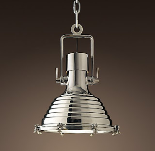
Less: The Mariime Pendant from Restoration Hardware $625
THE GALLERY
Bank, Andes, NY, 1987
Lee Melahn, Photographer
Available through Pleasant Living


No comments:
Post a Comment