DUNCAN PHYFE
One of our goals each time we get to New York is to take advantage of at least one cultural opportunity afforded by a city with culture to spare. We have established rules. We can not use a trip to the Club Monaco store to check out their newest men's collection as a way of having satisfied this obligation even though we've tried many times to justify this type of "cultural" enlightenment. Our past trip to the city was shorter than usual this time but we did manage to see Albert Nobbs and we did make it to the Met to see the Duncan Phyfe exhibit. The movie is a stretch in terms of having fulfilled our obligation but the Duncan Phyfe exhibit definitely gave us high cultural points.
I'm not fond of much of this late eighteenth/early nineteenth century movement in furniture design but when we walked into the American Wing and into the Phyfe exhibit I realized if I looked at the details of the work I could find reason to appreciate, no admire, the work of Duncan Phyfe.
Duncan Fife arrived in America in the early 1780's having crossed the Atlantic from Scotland as a rather poor immigrant. His family settled in Albany where Duncan learned his craft. By 1791 he had moved to New York City, set up his own shop and changed his name from Fife to Phyfe. Branding was as important in the early 19th century as it is now. Trading an "F" for a more sophisticated "Ph" attracted a deeper pocketed clientele. It was his way of putting the polo player on his dining room chairs. For almost 50 years the Duncan Phyfe factory produced furnishings for Northeast, Mid-Atlantic and wealthy Southern customers. The exhibit at the Met covers three distinct periods of furniture design as imagined by the craftsmen at Phyfe.
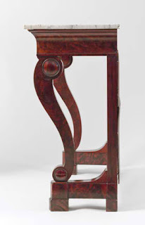
There were an abundance of "Pier" tables on display as examples of this phase in the Phyfe timeline. Looking like an entry console to me the derivation of the name "Pier" came from the mirror placed at the bottom back of the table. This I learned from Rick whose knowledge of historic furniture design is encyclopedic. Apparently due to the floor length dresses that were the fashion of the time the mirror served as a way for ladies to check their hems. No woman of the time would want an uneven hem, or a bit of slip showing or, God forbid, an exposed ankle. It may have been modesty or the need to protect their vanity that told someone it might be more delicate to at the least change the spelling from "peer" to "pier" From there on out any reflective surface acquired the moniker of "pier". Maybe in today's culture JLo should have used a "Pier Mirror" before she decided to walk out Oscar night exposing one areola for all the children to see.
The crowning piece at the end of the last gallery was this beautiful cabinet. I got caught taking a picture of this elegant piece with my flash and had to leave the gallery in shame and embarrassment. There were plenty of tourists feigning foreign accents leisurely walking through the exhibit with their cell phones nonchalantly held at their waists discretely video taping the entire exhibit.
I guess if I want to see the detailing I so admired I'm going to have to buy the catalogue of the exhibit, Duncan Phyfe: Master Cabinetmaker in New York. It's on sale through amazon,
Thank you Duncan for fulfilling our monthly cultural obligation.
WORDS FOR THE WISE
This weeks word: Klismos
Klismos refers to a type of chair attributed to the Greeks. The chair is defined by a soft curving back that s-curves through the seat and then down to the curve of its legs. The French resurrected the form with their Directoire style followed by the English and their English Regency and finally incorporated by us with our American Empire versions.
ACCESS NYDC
We feel very fortunate to have been selected as one of the design teams for "Access to Design". Please check out our page on the Access website: http://nydc.com/www/index.php/design_services/access_to_design
THE GALLERY
Pont des Arts, Paris, 1987
Michael Kenna, Photographer
Represented by Robert Mann Gallery


No comments:
Post a Comment