Thursday, January 31, 2013

PRIDE AND A CASE OF WEAK MORTAR


A DEVELOPING DESIGNER
The debate goes on between hereditary and environmental acquisitions of talent. Are you born with the ability to see space and combine pattern and color or do you develop the talent? Case in point: our daughter. Since Emmy was adopted and we didn't use a surrogate there's no blood relationship here, but as sure as I am that Sarah Palin is a tea party conservative, Emmy shows the begins of being a gifted designer. I guess we'll never know if her sense of style was passed down from her birth parents or if it came from just hanging around with us (we've been told by several sources that we do have a knack with that sort of stuff). Emmy seems to be turning into the little designer.
Take a look at her room. The first thing that struck a cord was her understanding of concept. She wasn't willing to go out and buy just anything that caught her eye. She really stopped to ponder what it was about the feel of the room she wanted to create. Her budget was very limited and she had to work with a lot of things we already had, but she knew what she wanted was a sense of joy mixed with nostalgia.
She chose a period in time and although I didn't see her racing to the library to do any pictorial research she paid close attention to her movie references and picked up on the bohemian eclecticism of the sixties.
She then began to space plan her room doing a layout with moveable pieces representing her furniture. By this time she had a strong understanding of how she actually uses her space and how she prefers to live her life. She isn't one to sit down at desk to do her homework. Instead everything gets spread out on the bed where she lies on her stomach typing away on her computer while plugged in to her iphone listening to her music. I always give her a hard time about music but secretly I think she has a very sophisticated playbook ranging from Mumford and Sons on into Adele and Lana Del Rey.
Her room is a vision in color and pattern with a million personal touches that explain her passions and her past. Every little setting is a tableau. Her dressing table is right out of a movie set. Her bed is fit for an Indian princess. I tried to push her to go over the top but she knew when enough was enough and she wouldn't let me sway her.
When you can see your own passions showing up in the soul of your child life takes on an astonishing new meaning. It might be too early to say she's found a path in life, a direction, she-s only sixteen but to see her enjoy our profession and start to pick it up as her own is a reward a parent dreams of.


FATE
We'd been trying to figure out our role in Madison as designers and retailers. Our furniture and interior design have always been our main focus. The retail aspect of our journey here was always a way to the means. We thought the retail might provide us with some recognition and a means to acquiring a reputation and through that a client base. It had started to look like the retail part of our business had done what it could. Location is a big factor in Madison and we were too naïve to think that if you built it they would come.
Our retail clientele started dwindling and our design business started skyrocketing in the New York area. Our diligence with the store had begun to wane. Sometime last week around Friday or Saturday fate seems to have taken over when the front of our beloved little bungalow decided to part ways with the rest of the house. We're taking this as a sign and moving our design works to our home office until we find out we can't stand to be with each other 24/7. The phone remains the same, 608 251-0995. It may take us a little while to settle in but be patient. Who knows, we may end up a pop-up store somewhere where you least expect it.


THE GALLERY
Still from Ang Lee's "Taking Woodstock"
Photographer unknown

Friday, January 25, 2013

A STORM IN BLUE-GREY


CREATING THAT MOMENT JUST BEFORE THE STORM
We've visited this moment before, that time in a weather pattern when the air is so still the leaves are like pieces of steel immobile against a blue-grey sky. The beating rain is still miles away. It's that time that makes you want to go inside to pull up a comfortable chair in front of a big window with a warm cup of coffee and take in the amazing beauty of Mother Nature's spectacle. It's a combination of tranquility and danger.
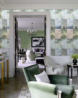
Wallpaper designed by Little Owl Design in Holland brings that moment of tranquility and danger inside.
Here it spreads that moment into a constant with their paper called appropriately, "Storm".
My favorite designers, Shelton-Mindel, have added the hint of the storm to this design in a more contemporary space. You get the color of the storm and just as in the real world the sun can still shine through in that moment when the storm is approaching but rays of light burst through the clouds like flood lights on a stage.
The moment before a storm can also bring a chill. There can be a sudden drop in temperature. It's that time when you pull out the cashmere throw to wrap around you as you curl up in that overstuffed chair or slip into a bed with throws by Restoration Hardware.
The contrast here pits the warmth of a vintage sofa against the cool of the raw concrete wall. It's the same combination that causes a storm when a high front meets a low and the thunder and lightening starts it's showy side.
Here in Wisconsin we have the Iron Horse Hotel where comfort exists in a palette of stormy colors and materials. Milwaukee may not be the first city to come to mind in design but it's a city that holds design in high regard and contains a cache of amazing design jewels.
A starker more dangerous approach to the storm inside happens in this space using faux metal panels made of ceramic tile by Oxy and available through Nemo Tile in New York. That coldness of steel and danger of graffiti make a perfect interior storm.
Even the kitchen can pull in the essence of a storm through color. This kitchen captures the beauty and peacefulness of a warm rain.
As the temperatures here drop into the negative numbers the thought of summer storm is warming and inviting and a diversion from the winter cold.


THE GALLERY
Cloud Tornado
Marc Yankus, photographer
Available through: sales@photographersgallery.com

Saturday, January 19, 2013

"Q" STANDS FOR WHAT?


"Q"
It was Rick's turn to define a design tip. I would have hit the obvious: quantity vs. quality, a queer eye, or quintessential choices. This would never have been Rick's way; no. He comes up with the "Quiver-leg". Sometimes I just feel stupid.

QUIVER-LEG
In historical styles the quiver-leg is described as a round, tapered chair leg used in the Louis Seize style and similar styles.  I find it a very early example of modernism; though it was fluted it was a much simpler, less ornate leg than those that came before it.
Look at the legs of a lot of mid-century modern furniture and there you will find that leg, minus the fluting, used in abundance. The simple beauty of T.H. Robsjohn Gibbings furniture in the 1940's for Widdicomb Furniture company gave rise to the frequent use of this style of leg in the Golden age of Modernism and has continued to be an elegant form to this day.
It is now a classic furniture form and whether plump or attenuated, it adds elegance to any piece of furniture it graces.
We've used it on several pieces in our new Mendota collection.


THE MURALS OF NEW YORK
This started out as a research project on graffiti for a current project we're working on in New York. The graffiti got me thinking about wall art either aerosoled or painted on the walls of New York City buildings done both legally or initially illegally. The history of tag art goes back to its initial illegal roots in the 1980's.
Then in 1993 the Phun Phactory was opened in Long Island city where graffiti signers were given a place where they could legally create their art on the walls of an old factory building. The Phun Phactory is now known as 5ptz (5 Points), an outdoor art gallery, art school and indoor studio space for the graffiti aficionados. It attracts artists from all over the world and tour buses of admirers who line the streets with cameras taking in the vibrant ever-changing façade of this Long Island building
One of New York's most prominent vigilante artists was Keith Haring. I can remember seeing his chalk drawings showing up in Subway stations across Manhattan in the late 80's, early 90's. His cartoonish characters and amazing sense of pattern were ingenious. Another soul lost way too soon, some of Keith's outdoor murals have survived and have been preserved. That's a good thing.
Much of the original graffiti of the late 20th century was considered vandalism and many of the original artists were arrested for their expression. On the other hand the depression era of the 1930's also produced a bunch of wall art some of which couldn't have happened without the support of the government and the WPA. A prime example of this is the McGraw Rotunda in the New York Public Library. The Story of the Recorded World, is a series of four arched panels painted on the ceiling of the rotunda, think Michelangelo, painted by Edward Laning from 1938-1942. Thematically the murals are a combination of religious moments and their recorded history through the written word.
Done at approximately the same time, one can once again see the amazing murals of the life of Theodore Roosevelt in the Theodore Roosevelt Rotunda at the American Museum of Natural History.
The murals painted by William Andrew MacKay in 1935 have gone through a lengthy renovation and have recently reopened to the public.
Similar to the controversies facing the graffiti artists of the 80's, this era of massive mural art was not without its controversy. There is a beautiful mural enveloping the lobby of 30 Rockefeller Center. Originally painted by the Mexican artist, Diego Rivera, titled, Man at the Crossroads, this mural included society women drinking alcohol, images of jail cells and a very controversial image of the Russian leader of communism, Vladimir Lenin. How the Rockefellers missed these aspects of the mural prior to it being completed is a bit amazing to me but, nonetheless, when the painting was completed the Rockefellers were so outraged that the mural was shrouded behind a curtain and then destroyed. The current mural was substituted for the original. Painted by the Spanish artist, Josep Maria Sert, it is titled, American Progress, and depicts a group of more appropriate historical figures like Abraham Lincoln, Mahatma Gandhi, and Ralph Waldo Emerson.
One of my favorite murals is at the back of the bar in the St Regis Hotel. Painted in 1932 by Maxfield Parrish, the mural depicts the nursery rhyme of, Old King Cole. The mural suffered the effects of most bar art during the later part of the 20th century. Saturated with the smoke from cigarettes and cigars, the natural accompaniment of beer and alcohol, The King Cole mural needed some emergency restoration.
The mural is now back in place and the new non-smoking regulations that are now law in almost every city will insure that the mural delights new imbibers for generations to come.


THE GALLERY
Bijou of Montmarte, 1933
Brassai, photographer
Rperesented by Edwynn Houk, NYC

Friday, January 11, 2013

DESIGN TIPS


THE LETTER "H" IN DESIGN
This week all of the Access to Design designers were given a task of coming up with a design axiom formulated after a letter from the alphabet. I was given "H", Rick has to deal with "Q". The full alphabet will be published on 200 Lex's website: www.NYDC.com. There are then plans to film each of us in a showroom at the New York Design Center presenting our design tip. Can't wait for that part.
Here's my tip:
H is for Height, the forgotten dimension in many design schemes. We all tend to start out looking down on our schemes and floor plans, deciding where we want walls, how we want to move through our spaces, and where we want to place our favorite chair. It's that third dimension that many people find it difficult to come to terms with. That's why a living room ends up looking unfinished and drab because the height of the sofa is the same as the height of the tv console, and that beautiful club chair you just had to have all seem to end at about waist height.
In making a room look complete you have to address the vertical elements making sure you've added variety and keep your eye lifted up rather than cast down. Break up the walls with floor lamps giving the wall a vertical break. Use window treatments to draw the eyes up and soften a harsh stark one-dimensional wall.
Add a tall piece of furniture like a hutch or an armoire to give added storage and a relief from the monotony of a furniture plan bogged down with elements all tethered to a plan that doesn't reach for the ceiling but ends about a third of the way up the wall. Don't forget height when planning out any living space. It can stretch a room from humdrum to totally satisfying.


MORE OR LESS
I have always contended that good design doesn't depend on money, at least not money alone.   I've spent a career matching "the proverbial Gap T-shirts with Armani suits "or the decorating equivalent to that fashion trick employed by many even the ever stylish Sharon Stone in order to create beautiful spaces while trying to stay on budget.  The trick here is to watch the quality quotient.  Finish is usually the first give-away of a poor quality item.  Wood should look like wood, stone should look like stone, and you get the idea.  These days construction doesn't have to be flimsy to make something for a lesser price and veneers are used throughout the industry whether high or low.  Just pay attention to how they are cut, glued up and used.  MDF is not a four-letter word but particleboard is.  Structure is important.  Chairs, sofas and benches should support people of substantial size and tables should never wobble. This week's light fixtures have the feel of expensive jewelry. One is the equivalent of real diamonds and the other may be a bit more like paste but the look is hard to distinguish.
The Mother Chandelier from designer Baran Baylar at Hudson Furniture. $25,000 in nickel, $29,000 in bronze
36W x 60H
Arteriors the Yale 4L iron cascading chain chandelier $1134
15W x 57H


OUR FIRST AWARD FOR 2013
We weren't even aware that we were being considered for this award but it was a wonderful little surprise in my email from the people at Design Shuffle. We were selected as one of 10 winners in the Mid-West region based on popular votes by the Design Shuffle community and industry
Here's a link to the award post:
http://www.designshuffle.com/blog/the-design-shuffle-top-10-of-20130-winners/
Thanks Design Shuffle!

THE GALLERY
Mountains
Ansel Adams, photographer
Represented by Weston Gallery, Carmel, CA

Friday, January 4, 2013

THE VIEW TO ABOVE


LOOKING UP INSIDE
When I first moved to New York a friend gave me some very good advice. One afternoon we were walking around the city looking at the quaint picturesque shops and streets in the Village. It was like a movie set compared to the gravel roads and strip malls I grew up with back home in Georgia. I kept marveling at the beauty in front of my face but it was my friend who said, "Don't forget to look up". I might have walked right down that street full of shops for a decade of time without seeing the exquisite beauty of the rooftops and terra cotta work that adorned the tops of those shops. It was a series of crowns on top of architectural royalty. The sidewalk perspective belied the detail and glory of the beauty that rested above my eye level. I've been sure to look up ever since. This advice has served me well in my current career as an interior designer. All of this is to say if you're designing or decorating a room, don't forget to look up.

CEILINGS IN HISTORY
The religious have always looked to the heavens for guidance and inspiration. No ceiling is more famous than the Sistine Chapel done by the master ceiling painter, Michelangelo. If you were a docent here I'd hope you'd be eligible for free chiropractic sessions for that crick in your neck form always looking upward to this breathtaking vista.
On a more recent note here in New York a piece of overhead history is frequently over-looked by millions hurrying and scurrying through Grand Central Station. The ceiling of Grand Central was painted to represent the astrological sky in 1912. Some time in the thirties the sky was painted and plastered over to hid cracks and the erosion of what was thought to have been caused by the coal and diesel smoke from the trains entering and leaving the station. When the restoration of the ceiling was begun it was discovered that the discoloration was actually the result of tar and nicotine from the millions of commuting smokers that left their mark over decades. Now the ceiling is a spectacular mural in green and gold of the celestial skies unfortunately painted backwards. Oops.
Back in Wisconsin the State Capitol is a wonder of coffering and murals painted by the artist, Edwin Howland-Blashfield. Back when kids were allowed a greater freedom and I was a pre-teen; on weekends I'd take my quarter, walk the mile and a half to the closest bus station and ride to downtown Madison. I'd roam the capitol from the maze of hallways, to the secret museums, to the center of the rotunda where you could look up in awe at the incredible spectacle of the ceiling above.


CEILINGS THAT INSPIRE
Here are some ideas for ways to make the ceiling in your room something to inspire, something to make you want to look up.
There is no rule that says a ceiling must be white. Use color to create drama from above. Using a dark color can make a cavernous space seem more intimate.
Painting the ceiling the same color as the walls can create a sense of spaciousness where the envelope can almost disappear leaving a very Zen quality to a room.
Wallpaper isn't for walls only. Here the wallpaper is brought from the wall right up over and onto the ceiling. The bold pattern in this soft grey room adds interest to a space that could be a little too bland without it.
We've used wallpaper on the ceilings of several of our projects. Here the ceiling is filled with a field of stars making reading in this library an adventure in the outdoors.
Another way to make people look upward is to take away the ceiling and let the structure that would support it be exposed. The pattern of exposed beams and trusses can be very exciting.
Or here where the structure of the ceiling is open covering the mechanical aspects of the space in a pattern based on ancient structural methods. You can see through its laciness in a way that makes what lies behind it a mystery that you want to solve.
This coffered ceiling raises your eye and your spirit as you enter this space. The space is not ecclesiastical but the feeling is one that can't help make you sense a greater presence.
So look upwards in your design work and give your space a sense of rising above the ordinary and stretching your design to attain an extraordinary canopy of interest and beauty.


THE GALLERY
A Perfect 6am Walk
Mathijs Delva, photographer
Available at http://www.mathijsdelva.be