Friday, January 4, 2013
THE VIEW TO ABOVE
LOOKING UP INSIDE
When I first moved to New York a friend gave me some very good advice. One afternoon we were walking around the city looking at the quaint picturesque shops and streets in the Village. It was like a movie set compared to the gravel roads and strip malls I grew up with back home in Georgia. I kept marveling at the beauty in front of my face but it was my friend who said, "Don't forget to look up". I might have walked right down that street full of shops for a decade of time without seeing the exquisite beauty of the rooftops and terra cotta work that adorned the tops of those shops. It was a series of crowns on top of architectural royalty. The sidewalk perspective belied the detail and glory of the beauty that rested above my eye level. I've been sure to look up ever since. This advice has served me well in my current career as an interior designer. All of this is to say if you're designing or decorating a room, don't forget to look up.
CEILINGS IN HISTORY
The religious have always looked to the heavens for guidance and inspiration. No ceiling is more famous than the Sistine Chapel done by the master ceiling painter, Michelangelo. If you were a docent here I'd hope you'd be eligible for free chiropractic sessions for that crick in your neck form always looking upward to this breathtaking vista.
On a more recent note here in New York a piece of overhead history is frequently over-looked by millions hurrying and scurrying through Grand Central Station. The ceiling of Grand Central was painted to represent the astrological sky in 1912. Some time in the thirties the sky was painted and plastered over to hid cracks and the erosion of what was thought to have been caused by the coal and diesel smoke from the trains entering and leaving the station. When the restoration of the ceiling was begun it was discovered that the discoloration was actually the result of tar and nicotine from the millions of commuting smokers that left their mark over decades. Now the ceiling is a spectacular mural in green and gold of the celestial skies unfortunately painted backwards. Oops.
Back in Wisconsin the State Capitol is a wonder of coffering and murals painted by the artist, Edwin Howland-Blashfield. Back when kids were allowed a greater freedom and I was a pre-teen; on weekends I'd take my quarter, walk the mile and a half to the closest bus station and ride to downtown Madison. I'd roam the capitol from the maze of hallways, to the secret museums, to the center of the rotunda where you could look up in awe at the incredible spectacle of the ceiling above.
CEILINGS THAT INSPIRE
Here are some ideas for ways to make the ceiling in your room something to inspire, something to make you want to look up.
There is no rule that says a ceiling must be white. Use color to create drama from above. Using a dark color can make a cavernous space seem more intimate.
Painting the ceiling the same color as the walls can create a sense of spaciousness where the envelope can almost disappear leaving a very Zen quality to a room.
Wallpaper isn't for walls only. Here the wallpaper is brought from the wall right up over and onto the ceiling. The bold pattern in this soft grey room adds interest to a space that could be a little too bland without it.
We've used wallpaper on the ceilings of several of our projects. Here the ceiling is filled with a field of stars making reading in this library an adventure in the outdoors.
Another way to make people look upward is to take away the ceiling and let the structure that would support it be exposed. The pattern of exposed beams and trusses can be very exciting.
Or here where the structure of the ceiling is open covering the mechanical aspects of the space in a pattern based on ancient structural methods. You can see through its laciness in a way that makes what lies behind it a mystery that you want to solve.
This coffered ceiling raises your eye and your spirit as you enter this space. The space is not ecclesiastical but the feeling is one that can't help make you sense a greater presence.
So look upwards in your design work and give your space a sense of rising above the ordinary and stretching your design to attain an extraordinary canopy of interest and beauty.
THE GALLERY
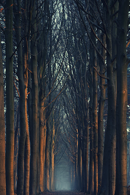
A Perfect 6am Walk
Mathijs Delva, photographer
Available at http://www.mathijsdelva.be
Subscribe to:
Post Comments (Atom)


No comments:
Post a Comment