Friday, May 31, 2013

ICFF 2013 PART 2

THE TRENDS

Trends are always a part of what bloggers and design soothsayers are on the lookout for at ICFF. I'll admit it; I'm no different.  I'm sure there was much more to marvel at then what I'm about to highlight. Having to man our booth didn't allow for a lot of time to see the rest of the show. I was forced to use my flea market buying technique, which requires a roving eye, a pair of track shoes and a great deal of luck.
Here's what I saw that I felt set some worthy trends. First was the introduction of technology, well not just technology but TECHNOLOGY. Now some will say that was so yesterday but the technology at the show this year went way past my imagination. At Focal technology and ergonomics were in full swing with these workstations of the future. These tractor-like seats pivoted from a central stem swaying with your body position as you reached to your right or left.
Everything about the work surface was arranged for maximum utilization of space and included every current gadget you could think of. These workstations were a designer's dream and lines of people trying them out were testament to their originality.
Technologies effect on the senses wasn't limited to sight and touch. Vendors specializing in the field of audio advancement were in abundance at the show, but none were as eye-catching or pleasing to the ears as Oswalds Mill Audio. The shear size of their speakers was enough to make you look twice. Their wooden megaphones atop trapezoidal bases hinted at nostalgia with a very contemporary twist. And the sound was magnificent. I was just thankful we were on the total opposite end of the hall. They ran those speakers at high volume 24/7.
Rugs also did a spin on combining old and new. Since I could only run the show I wasn't able to stop and talk to the people at Jan Kath so I can't really comment on the true technique used here but I can tell you that the results were spectacular. Here's what they looked like. They appeared to have taken vintage Tibetan/Moroccan rugs that may have been worn out in spots and then rewoven over them with new silk and wool.
The effect was like looking at an Egyptian hieroglyph where the colors had faded a bit and parts of the original had been lost exposing the underlying surface but in a good way. I loved these rugs. I loved the sense of history they possessed. I loved the recycled aspect. I loved the designer's ability to choose the perfect colors and the right amount of new weaving to make these awe-inspiring pieces of art. It was no wonder they decided to hang these on their walls rather than lay them on the floor.
Still trending were the references to mid;-century; the forties through the sixties. Jonathan Adler was there with his ever present homage to a bygone Palm Springs but so were FAB with their sixties kitsch that may have swung more toward accessory than furniture.
One of my favorite wall-covering vendors was this small booth of whimsical wallpapers at the near end of our aisle. I never got the vendors name but every time I passed it by on my way out or off for an outrageously priced Grande Java Chip Frappuccino Lite from Starbucks it made me smile.
How could I not end without referencing the biggest trend of the show - the live edge. It seems everyone is jumping on this bandwagon. If saw one live edge table I saw a dozen. Here the people of Sentient have used the live edge on their head and footboards. I expect Crate & Barrel, Room & Board and Pottery Barn won't be far behind with their own versions of the live edge. I actually think I saw a live edge table last week at West Elm.


THE GALLERY
Studio Chair, The Tappen House, Little Compton, RI
Peter C. Jones, photographer
Represented by Bonni Benrubi Gallery

Saturday, May 25, 2013

ICFF 2013 PART ONE

EVERYONE ELSE
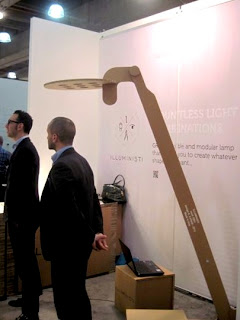
As difficult as it had been to get away for even a few minutes at ICFF, I managed to walk, no run, the show on early Sunday afternoon. Every year I'm amazed at the work that goes on display, and this year was no exception. A few steps to our right and you were in the booth for Illuministi, producing modular task lighting.
Their innovative product attracted a crowd the entire show and lit up the very end of our aisle.
Lighting was one of the more impressive categories throughout the entire show. One of my favorites has always been Moooi Lighting out of The Netherlands. We just installed a reception area at one of our current clients using these spectacular LED globes.
Apparatus was another favorite lighting company. When it comes to presentation their booth was that kind of booth that sucked you in. Beside the shear beauty of their product they were smart enough to display their fixtures against a black background making them even more eye-catching.
Two individual lamps that stood out to me were the Fife Tripod lamp designed by Matthew Fairbanks and this screw wall fixture I found in the area designated for designers looking for vendors and manufacturers. I failed to get the name of this designer but his playful wall mounted and table version screw lamps in brightly colored threaded posts and chrome stand-offs made me smile. Here humor was high but not to the detriment of sophistication.
Matthew's floor lamp, on the other hand, with its pencil thin cerused legs, polished chrome sabots and semi-spherical mirror-like shade was a showstopper for me. It was elegant, original and eminently sellable to most of our clients.
My last lighting find was this beautiful hand-blown pendant with a real mid-century feel. Designed by Avram Rusu Studios, it is part of their Confetti Glass Collection. It can be customized in a variety of colors making it a perfect focal point and bounce of color in the right setting.
Furniture wasn't as prevalent as it has been in the past but some of what was presented was worth the look. I'm in love with the work by Tod Von Mertens. Tod is a metal designer by trade but he has managed to blend his metal work with a beautifully polished finish reminiscent of driftwood. When the two materials meet they blur their differences making it almost impossible to distinguish what is metal and what is wood.
There's a lightness to his pieces that comes from his spot-on translation of form and shape into exquisitely tapered legs, elongated boxes and perfectly thin frames that wrap around his drawers.
James De Wulf, a young upcoming designer has found new ways of transforming concrete into tables and chairs that at times look more like plush cushy overstuffed pieces of furniture than virtually indestructible piles of aggregate and cement.
By far the cutest boy on the block had to go to the quirky designer, Palo Samko. One of his most intriguing pieces was a floor lamp that ascended more than fourteen feet from its tripod base to its black shade. It was one of those objects that was so impressive in person but impossible to translate into a single picture. I had to opt for this smaller version. Complementing the lamp were pieces carved out of beautiful chunks of wood and seating wrapped in worn leather. Not completely visible here but if you look closely you can see the inlay on his dresser that gave it the precise detail that takes a piece from the ordinary to the grand.
Not to be left out, for the first time to my knowledge, IKEA made an appearance. I'm sure there are purists who have poo-pooed ICFF for allowing them to exhibit but I for one have used them many times in some of our design projects. Not all of their products will stand the test of time or the crushing pounding of a four-year-old's mighty wheels but their design capability is frequently innovative and always under budget.


THE GALLERY
Cine York, 2011
Roberto Riverti, photographer
Represented by Dina Mitrani Gallery, Miami

Saturday, May 18, 2013

THE MENDOTA COLLECTION @ ICFF2013

MENDOTA
This post is begging to be brief. The introduction of a new line of furniture is exhausting if nothing else. Rick and I have survived day one of the fair too tired to make the Saturday night party, overjoyed to be sinking out heads into 1200 count Egyptian cotton pillowcases, and looking forward to dreams devoid of anxiety.
So keeping to my promise of brevity here's a series of pics taking our booth from nothing to magnificent.

Almost done


THE GALLERY
Woman as a Lamp
Rodney Smith, photographer
Represented by Edwynn Houk Gallery, NYC

Monday, May 13, 2013

ITALY AND ICFF


GRADITUDE
 There's always a breeze slipping up the hill rippling over the vineyard and zigzagging through the cypress trees that stand like sentries along the dirt road leading up to the farm in Armena.  For many years we've been blessed to find a low enough gear on our rental car to chug us up the hill to Fattoria Armena, high up in the Tuscan hills where we've taken our holidays on over a half dozen trips. A week here isn't enough. We always take two. Each year we've arrived cementing the bond  with the place and the people we share our vacation with. We've now sent groups of friends and brought relatives to Stefania and Alessandro Saraceni's beautiful villa and each visit I've recorded in a scrapbook. It's the gratitude for this opportunity that I'm sharing as we make our reservations for a trip six years in the making. It's been a long time, we've all grown, and aged and moved on, but the pull of this Tuscan haven will always tug at our hearts.

 SCRAPBOOKS
 I'm not sure if scrapbooking is too Martha Stewart or too the women who think they are Martha Stewart. This whole scrapbooking thing has become a cottage industry if one can call an entire area in your local hobby shop devoted to decals, borders, and bedazzling paraphernalia for putting together memory books a cottage industry. I hope I 've taken a different tact.
I've always collected things on every vacation we've taken: a book of matches here, a brochure there, a napkin from a restaurant where we had a spectacular meal. I'd come home with a bundle of ephemera wrapped in a rubber band and then not knowing what to do with it. I don't know if the idea came to me first or I stole the idea from seeing Martha do it but the scrapbooking idea seemed the perfect means for finding a home for all the things I'd collected from places I never thought I'd actually get to see.
Here are a few of my tips for putting together a scrapbook:
1. Don't buy a themed book with some designer's idea of what your vacation should look like. It may seem the easier way. You might tell yourself you're not talented enough to do it on your own, but no matter how rough around the edges it might be, it'll be truly your own. Buy a beautiful blank book and your set. Buy one with a marbleized cover and everyone will think you're a pro.
2. Don't be afraid to take a picture of a beautiful meal. Food is one of the biggest memories of a trip to somewhere you've never been before. There are so many entrees in our adventures whose presentation has been worthy of a photograph. It makes it so much easier to explain the appeal to everyone at home when you can show them a photo of what you ate before you ate it. A pizza lunch may not have been the most elegant of meals but when your sister's bad Italian ended up with ordering a pizza for everyone at the table a photo of the gluttony was an absolute necessity
3. I've been known to soak off the label of a great bottle of wine whose name I wouldn't have had a chance of remembering without the aid of a slightly tattered label.
4. Never rely on the first photo you take when you're doing pictures of little Ricky and all your friends at the local gelateria. It's always that second or third shot when they drop their frozen smiles and relax into a more candid and animated pose.
5. Bring a set of colored pencils and little sketchpad along with you. I'm hearing everyone out there saying, "but I can't even draw a straight line." First, no one needs to draw a straight line, in fact the more crooked and varied the line the more interesting the line will be. Then don't draw what intimidates you. Draw a beautiful door, a bowl of figs, the best slice of pizza you've ever had. Don't judge what you've done. Appreciate that it's yours.


ICFF

If you're in New York between May 18-21 please stop by the International Contemporary Furniture Fair at the Javits Center and see our newest furniture line, The Mendota Collection, for Black Wolf Design. Designed by Rick Shaver and Lee Melahn for the Wisconsin firm, Black Wolf Design

THE GALLERY
Nel bulo di un temporale - Assisi, 1967
Elio Ciol, photographer
Contact: elio@eliociol.it

Friday, May 3, 2013

THE MOST EXPENSIVE RETAIL STREET IN NEW YORK CITY

BLEEKER STREET
Who knew there was so much money in a cupcake. The stretch of Bleeker Street between Christopher Street and Eighth Avenue has out stripped Bond Street in London and The Champs-Elysees in Paris as one of the most expensive retail streets in the world.
Only some locations on Madison Avenue and Fifth Avenue have been able to command a higher price tag than the $6,700 per square foot tag that now hangs on the merchant doors that line Bleeker Street.
The street has become home to big names in the fashion industry, names like Michael Kors, Cynthia Rowley, Marc Jacob
and Ralph Lauren all have shingles facing the street with their names subtly displayed.
Ostentation never appears where real money exists. Let this be a lesson to you Donald Trump.
On this toney stretch of real estate you'll see fashion displayed at its most provocative.
You'll see coach bags displayed with price tags larger than a descent used car
and even the shops for kids exceed the price of a three-course meal with beverages for a birthday party for your seven year-old and thirty of her best friends at your local Applebees.
The draw at the end of the street is still the Magnolia Bakery where the tour buses line up and the Japanese get out with their cameras to take a picture under the awning at 410 Bleeker.
If you go to this swank little area you should also tour the side streets for some of the quaintest architecture New York has to offer.
When I first moved to the city the West Village was still filled with reasonable real estate and an abundance of hippie culture to go along with it.
The  village still retains its quirkiness but the price tag is way more silk and cashmere than cotton and denim. 


THE JEFFERSON MARKET GARDENS
It's one of the most famous corners in New York City, the intersection of Greenwich, Christopher and Sixth. Shooting Gothic towers to the sky, Jefferson Market, designed by Calvert Vaux and Clarke Withers in 1877
provides the shade and a romantic red brick background for one of Manhattan's most beautiful gardens.
The Jefferson Market Garden now blooms on the site of the former New York Women's House of Detention, a building built adjacent to the market and fittingly torn down so that flowers could grow where previously women had been incarcerated in inhuman facilities.
No longer do you hear the sounds of wailing women screaming from the windows of the jail to people walking below or waiting to hear messages from the loved ones shouting words of longing from the street.
Now beauty prevails where the crumbling house of detention stood.
Glamourous people now sit on benches ringed in tulips reading novels of mystery and squirrels have taken over from the rats take once ruled the street.


THE GALLERY
The NE Corner of Bleeker and Minetta Street, 1922
Photographer unknown
Source: The New York Public Library