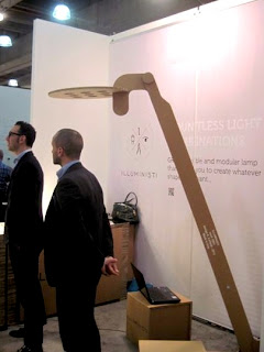
As difficult as it had been to get away for even a few minutes at ICFF, I managed to walk, no run, the show on early Sunday afternoon. Every year I'm amazed at the work that goes on display, and this year was no exception. A few steps to our right and you were in the booth for Illuministi, producing modular task lighting.
Their innovative product attracted a crowd the entire show and lit up the very end of our aisle.
Lighting was one of the more impressive categories throughout the entire show. One of my favorites has always been Moooi Lighting out of The Netherlands. We just installed a reception area at one of our current clients using these spectacular LED globes.
Apparatus was another favorite lighting company. When it comes to presentation their booth was that kind of booth that sucked you in. Beside the shear beauty of their product they were smart enough to display their fixtures against a black background making them even more eye-catching.
Two individual lamps that stood out to me were the Fife Tripod lamp designed by Matthew Fairbanks and this screw wall fixture I found in the area designated for designers looking for vendors and manufacturers. I failed to get the name of this designer but his playful wall mounted and table version screw lamps in brightly colored threaded posts and chrome stand-offs made me smile. Here humor was high but not to the detriment of sophistication.
Matthew's floor lamp, on the other hand, with its pencil thin cerused legs, polished chrome sabots and semi-spherical mirror-like shade was a showstopper for me. It was elegant, original and eminently sellable to most of our clients.
My last lighting find was this beautiful hand-blown pendant with a real mid-century feel. Designed by Avram Rusu Studios, it is part of their Confetti Glass Collection. It can be customized in a variety of colors making it a perfect focal point and bounce of color in the right setting.
Furniture wasn't as prevalent as it has been in the past but some of what was presented was worth the look. I'm in love with the work by Tod Von Mertens. Tod is a metal designer by trade but he has managed to blend his metal work with a beautifully polished finish reminiscent of driftwood. When the two materials meet they blur their differences making it almost impossible to distinguish what is metal and what is wood.
There's a lightness to his pieces that comes from his spot-on translation of form and shape into exquisitely tapered legs, elongated boxes and perfectly thin frames that wrap around his drawers.
James De Wulf, a young upcoming designer has found new ways of transforming concrete into tables and chairs that at times look more like plush cushy overstuffed pieces of furniture than virtually indestructible piles of aggregate and cement.
By far the cutest boy on the block had to go to the quirky designer, Palo Samko. One of his most intriguing pieces was a floor lamp that ascended more than fourteen feet from its tripod base to its black shade. It was one of those objects that was so impressive in person but impossible to translate into a single picture. I had to opt for this smaller version. Complementing the lamp were pieces carved out of beautiful chunks of wood and seating wrapped in worn leather. Not completely visible here but if you look closely you can see the inlay on his dresser that gave it the precise detail that takes a piece from the ordinary to the grand.
Not to be left out, for the first time to my knowledge, IKEA made an appearance. I'm sure there are purists who have poo-pooed ICFF for allowing them to exhibit but I for one have used them many times in some of our design projects. Not all of their products will stand the test of time or the crushing pounding of a four-year-old's mighty wheels but their design capability is frequently innovative and always under budget.
THE GALLERY
Cine York, 2011
Roberto Riverti, photographer
Represented by Dina Mitrani Gallery, Miami


.jpg)
No comments:
Post a Comment