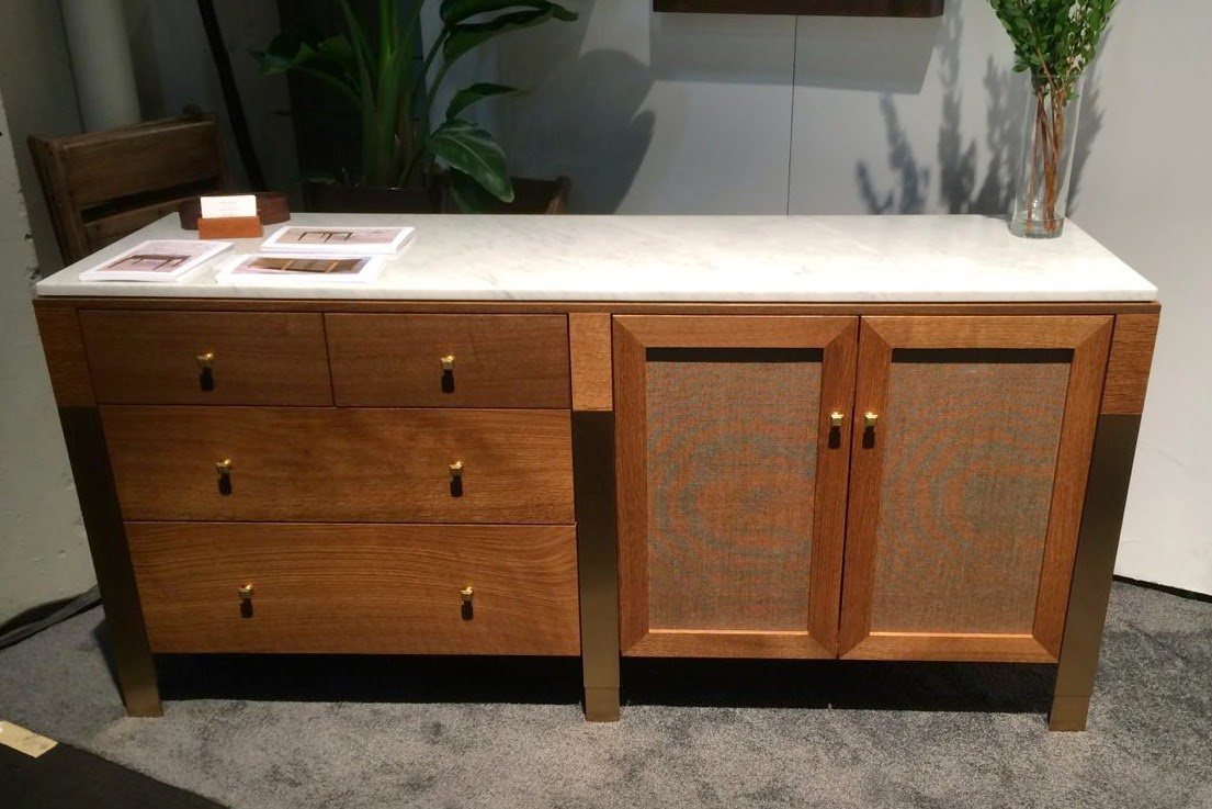
We'd almost signed up for another shot at ICFF (International Contemporary Furniture Fair) this year. We'd developed some new products in the Mendota Collection for Black Wolf Design. We're in development for an additional line for Black Wolf and we are considering officially pulling the Shaver/Melahn line out of mothballs and reintroducing some of the past successes, but financing the show is a big issue and without the money we decided it was best to wait. Additionally, once you've done the show you've only completed the first part of the commitment. The second and maybe even more important part is the necessary follow up. Without a PR person in place to investigate leads, work with potential showroom salespeople, hit the party circuit and schmooze the publishing industry it can be a waste of time and money and a hard lesson to learn. We decided to wait until next year and then evaluate whether to do ICFF or the Architectural Digest Show. This year I became merely a spectator at ICFF.
Here's what I saw that either impressed me or set what I thought was a trend. There was a lot of good, bad and the ugly in both categories. I'm going to start with trends and just get the ugly out of the way right from the start. I'm not going to name names here but the biggest trend I saw was imitation and not in a good way. They say imitation is the highest form of flattery but at a show like ICFF I think the goal should be to show new ideas and things nobody else has thought of before or bothered to transform from paper to product. A good idea is a good idea but there were too many ideas that were rip-offs of someone else's successful idea with the most minimum of alterations. If you're going to go that route at least call your creation an homage to its original designer or inspired by the person who first designed the piece rather than putting it out there and calling it your own. Okay, the ugly's now out of the way.
The trend of the live edge seems to be running its course. There were some people still showing this trend and none more successfully than Tucker Robbins. His work is always beautiful and very ethnically inspired.
There's no denying the beauty of these exotic species of woods and the beautiful grain patterns. His finishes are all simply transparent allowing the woods to do all his talking.
As opposed to the mastery of Tucker Robbins and his exotic species there were more designers showing native American woods with polished finishes. The people from Skram exhibited some amazing polished and bleached woods where the grain of the material was so intrinsic to its beauty it was as if an artist had painted it.
The sheer material was as worthy as Tucker Robbins' slabs of being hung on a wall.
This is not the first time I've seen Palo Samko's work and not the first time I've written about it but each time I see his vision I'm impressed with what he produces. There is elegant simplicity in everything he shows,
I loved this little table by Newell. Again, the beauty of the wood allowing the grain to make a statement was a delight to see. The turned base with the silver support gives the piece the right amount of contrast. There's great whimsy in this design yet it isn't cartoonish.
A newcomer to the show was Brooklyn designer, Jerry Nance. He only had three pieces but each piece was meticulously crafted combining woods and metal.
All his hardware is hand forged. It's this attention to detail that is the sign of a true craftsman. I hope this is a designer we'll be seeing more of.
What I liked were the textiles. I shouldn't be promotimg this at a fair that bills itself as a furniture fair but there were some exquisite pieces that really caught my eye. I know my first little tirade about the abundance of mimicry might make you think about my first true like at the show but these rugs by Nanimarquina were really well designed and certainly an homage to the graphic work of the 1920's adding a twist by plugging those graphics into the twenty-first century art of circuitry design. They chose to hang them on the wall that, in my opinion, is exactly where they should be hung. Their booth was at the front of the hall so it was one of the first things you saw as you entered the exhibit. Not bad placement, it set a high level of expectation for what I hoped to see in aisles that spider webbed out from this nucleus.
Jan Kath has also shown at the show several times before and each time their rugs amaze and are true art for the floor. Again they take from the past but they move the yardstick further along the design continuum. They reference past design and rug history but then scramble up your perception of it and come out the other end with something totally new. Design like this doesn't come cheap but the for the right client these rugs are true heirlooms.
The industrial look is all over the retail floors due in great part to Restoration Hardware. I'm not sure how much longer it can last. I don't know if it will receive classic stature but there's a part of me that still can't resist its magnetic pull. The concrete wall designs of Tom Haga for Resource Furniture was another wall covering that drew my attention. Each order is a custom printed matching the design to the exact measurements of the wall you want to paper.
One of the most impressive booths at the show was put up by a company called Amuneal. Their focus was on a modular paneling system of metal and glass. It may have been more contract than residential but I could see it having cross-platform uses. The industrial references here were very strong and as far as a booth at the show goes this one was impressive
Another textile I was enamored with was the work of Parisian designer, Sophie Mallebranche. Her woven metals had the lightness of intricate lace work. The shimmer of the material and the way it played with light made me think of light on a summer pond or the reflection of a twilight moon on a patch of winter ice.
Hiroko Takeda creates art out of fiber making wall coverings, textiles and true art. Initially you think her work is trompe l'oeil but on up close inspection you see her pieces are really three-dimensional weaving. Then you assume the three-dimensionality has to be done with a very stiff fiber until you touch her work and feel its sensual silkiness.
The Asian influence is definitely there in her work where simplicity reigns.
I don't want to think that inventiveness and ingenuity is the sole proprietary right of youth. I feel I've still got a few viable tricks in me but one of the biggest crowd pleasers of the show came from the student section in Wilsonart's student chair competition. I'm not sure if this chair's creator took inspiration from the Soviet's Sputnik program, but the similarity is uncanny. I'm pretty sure he wasn't even born when those things splashed back into the ocean.
I kept thinking how great this would be if you had a rambunctious four-year old; load him in, close the door and throw in a video game - instant babysitter.
The last plug goes to Moooi. I got to use these Raimond fixtures in two projects last year. The structure is supposedly based on some mathematical formula I am sure is way over my head but the LED spectacle of little glowing lights can light a room in the same way the stars in an evening sky in Montana can. I love these fixtures.
THE PARTY
Every year there's an opening night cocktail party held in the courtyard at the Museum of Modern Art.
It's not required. Rick was back in Wisconsin so I had to go alone. I didn't know anyone. I had a ginger ale with a slice of lime. I didn't stay long, but the setting was still pretty cool.
THE GALLERY
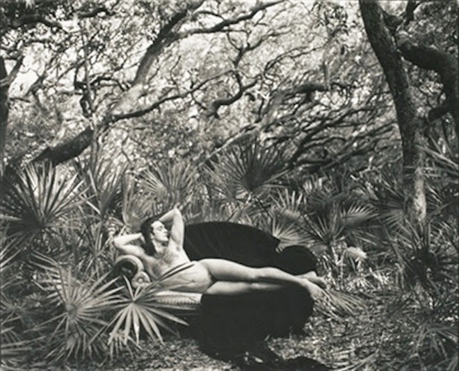
Mark Morris, Cumberland Island, GA, 1990
Annie Leibovitz, photographer
Represented by Fahey/Klein Gallery, LA
Photo inspiration: The Dream (1910) by Henri Rousseau
Painting hanging at MOMA


No comments:
Post a Comment