BRING IN THE HOLIDAYS
The first time the doors opened on New York's Holiday House was back in 2008. It was the vision of Iris Dankner, a breast cancer survivor. She wanted to fill a void in the design showhouse market that wasn't focusing on women's issues. This year as in the past nine years designers and architects have contributed to creating a showcase for their work and a way of contributing to an important women's cause, breast cancer research. The show came to a close on Wednesday. I toured the house on Monday wandering through the four floors of the historic Academy Mansion on East 63rd Street.
The first thing to catch my eye was right in the entry designed by BJS Associates.
Hidden under a fur throw was Johnny Swing's signature half-dollar welded chair. I've loved this chair from way back in the 1990"s when I first saw it at an ICFF show. It's a tremendous collector's art piece that's way more comfortable than it looks. Unfortunately, the price tag is not quite as comfortable
Walking through the entry leads right into one of the larger rooms in the showhouse designed by Groves & Company. It's titled the parlor. It offers a sleek contradiction to the very traditional envelope that encloses it. The high contrast black, white and silver design was a bit under-whelming and the issue of how to fill a very tall space seemed ignored with elements that only seemed to the cut the room in half on a horizontal plane. Huge vertical drapes were used to disguise the walls but if they had used a bold print or color other than white it might have solved the issue of ceiling that felt miles above your head.
There's a view from the parlor through a gentleman's lounge to the dining room designed by Kim Radovich Interiors.
This was one of my favorite spaces.
Of course, Kim was given some gorgeous architecture to work with, from the beautifully ornate vaulted ceiling to the arched windows the space was hard to muck up.
I loved everything from the art on the wall
to the exquisite table settings.
This room alone was worth the $40 entry ticket
Usually if you're given a small space you end up stuck with not being able to make a major splash but Stedila Design did a simple but significant creation under the main floors spiral staircase.
Playing off the curves of the staircase and illuminating the space with a cascading angular chandelier were just the right notes to create an eye-catching and an impressive conversation nook.
Sometimes meeting and talking to the designer at a showhouse is just as important as the design itself. That was the case with the tented courtyard supper club designed by Anna Maria Mannarino.
Even though it was the end of the show, Anna Maria remained in her space greeting and chatting. She was gracious and informative. This wasn't her first rodeo. She had done over a dozen shows and unlike most participants had collected commissions from all of them. The credit goes to her personality and willingness to engage.
If this hallway designer had just taken it down a notch it could have been a real showstopper. It was a showstopper but not in a good way.
The room at the end of this striped hallway was in total contrast to the opulent lead up created by that striped hallway. Alyssa Kapito's serene and inviting living room was a space I could live in.
Beautiful furniture
A monochromatic color palette
and a simplicity of design made for a space you could relax in in total comfort.
Two smaller rooms; one by Natalie Kraiem Interiors
and the other by Patrick Lonn Design were well worth walking into
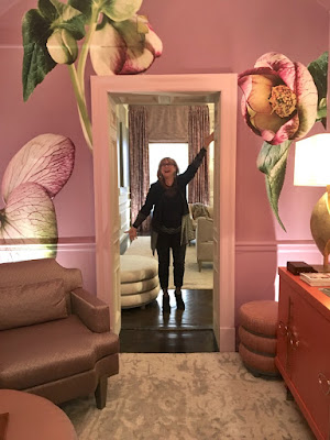
but Robin Baron's elegant sitting room was a treat of two sweets.
The main room was like a melt-in-your-mouth chocolate truffle, subtle in pastels and highlighting some of Robin's new furniture and rug collections,
the other an Easter basket of jelly beans and hard candy, fun and irreverent. Robin was there to walk you through and explain it all, a total sweet tooth experience.
Young Huh's kitchen in collaboration with Bosch was a hard one to understand.
The circuit board design on the cabinetry and storage wall was confusing and disjointed looking tacked on in the traditionally paneled existing architecture.
There's a fourth floor at the Academy and it seems everyone who gets stuck with this space is up against a losing battle. This year the room was turned into a game room but the result wasn't one I'd want to play in. It was more a promotional space for a sports company combining a foosball corner, pool table and a truck filled with riding equipment: saddles, reins and crops included. It's a huge room and a real challenge. If I was offered this space I'd decline.
Not wanting to end on a down note, James Rixner always comes through with New York's abundance of show houses
I don't know how he does it. His rooms are always beautiful. We know how deep your pockets need to be to do a single showhouse. Our hats are off to James and his company for the tremendous amount of charity work they do.
THE GALLERY
Snow on Garage Door, Rochester, NY, 1960
Minor White, photographer
Represented by Howard Greenberg Gallery


No comments:
Post a Comment